
February 2009 Archives
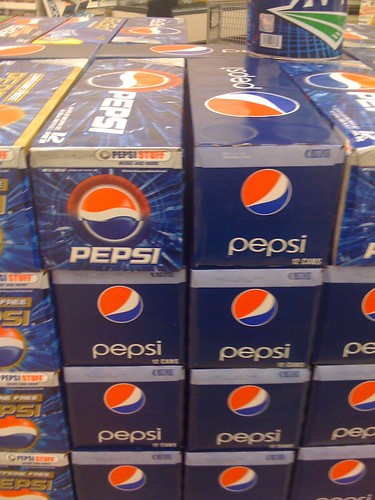
I don’t like the new “Bird’s Eye” logo that Pepsi has gone to. It looks weird to me. The old logo was fine.
However, the box design that’s rolled out with this new logo? Gorgeous.
Gone are all the background trappings. Gone is the ’80s style logo font. Instead there’s a very simple solid color, the new logo (ugh), and the word “pepsi.” It’s simple and very attractive.
Well done, box designer. Maybe you can have the logo guy’s job.
I’m a little less convinced about the new Mountain Dew boxes, which re-brand the drink as “MtnDew.” What, Mountain is too long a word? Come on.
My Pictures
www.flickr.com
|